What is an ADA-Compliant Website? The Complete Guide
By creating a website that’s accessible, not only do you avoid serious financial penalties, but you also expand your revenue-generation capabilities.
In today’s post, we’re going to cover what an ADA-compliant website is and share rules for staying compliant.
Download Now: Free Website Accessibility Checklist
Table of Contents
What is the ADA?
The ADA, short for the Americans with Disabilities Act, is a civil rights law that prevents discrimination based on disability. Its goal is to ensure that all people, especially those who live with physical and cognitive disabilities, are included in all areas of public life.
The Act was first brought to life in 1990 at a time when few businesses had a digital presence. For many years, despite the explosion of the internet, it was unclear if the law also applied to online spaces. This was finally made clear in 2010 when the ADA launched the Americans with Disabilities Act (ADA) Standards for Accessible Design.
To be compliant with this regulation, all the information on your website needs to be easy to access by those with disabilities. You must also make sure that there isn’t a separate path for those with any limitations.
For example, those who are visually impaired must be able to use a text reader to access your content, browse through your categories, or create a product return.
ADA is often confused with Section 508, which applies only to federal agencies, departments, or commercial sites that interact with these public institutions.
The website accessibility rules outlined in the ADA are much broader. They apply to virtually all businesses and web developers.
As explained on the State of Nevada site, “if a website is fully ADA compliant it meets all the requirements set forth in both Section 508 (if applicable) and WCAG standard.”
Why does ADA compliance matter?
Not only is ADA compliance the law, building an accessible website has benefits for your customer and your business. Learn more about the importance of ADA compliance below.
ADA compliance promotes equality.
If your website is in line with ADA requirements, you show that your company is inclusive. Demonstrating that you care about accessibility helps create a positive brand image.
Your business mustfollow the law to avoid legal fees.
Making sure your website is ADA-compliant is the first step to avoiding hefty lawsuits. Even if you simply overlook the issue of accessibility, you may face severe financial consequences in the form of:
- Legal fees.
- Possible settlements.
- The costs associated with rebuilding your website in compliance with the ADA.
- Potential public relations problems which might negatively impact your revenue.
ADA compliance improves usability.
Websites that focus on accessibility tend to be more user-friendly for everyone, not only for individuals with disabilities. For example, including video captions might come in handy while watching the content in a noisy space.
What does the ADA require?
Website owners should take a look at Web Content Accessibility Guidelines(WCAG)to ensure ADA compliance.
WCAG offers a set of standards applied internationally to improve web accessibility. It focuses on four key criteria:
- Perceivable– all the information, including user interface components, must be shown clearly. It can’t be invisible to all of their senses.
- Operable– users must be able to freely use the interface. Interactions that cannot be performed should be eliminated.
- Understandable– the information as well as the user interface must be easy to understand by users. They need to know what to do when they visit a website.
- Robust– the content must be robust so various user agents such as assistive technologies can interpret it.
If you want to see how your website performs as is, you can conduct a web accessibility report or evaluation. Both free and paid options are available.
Accessi.org is one option to check compliance. You can enter a URL, and the tool will generate an accessibility report. You’ll find out if your site is accessible and what changes you need to make to comply with the ADA.

Image Source
ADA Compliance Best Practices
Here are a few actions related to the content, website functionality, and design, which you can take to achieve ADA compliance.
1. Make sure that your web content is accessible.
Keep sentences short and simple.
The shorter your sentences are, the easier it is for readers to understand your content. The same goes for using simple terms instead of industry jargon. Some other rules to follow include:
- Using bulleted lists (like the one you’re looking at) to break up long paragraphs.
- Including a table of contents, key takeaways, and a summary section.
- Bolding the most important phrases.
Aim to keep the most important information as close to the top of the page as possible. Also, if your language uses a left-to-right script, align all text to the left.
This approach will make your website more useful and legible for all visitors — not only those with disabilities.
Ensure proper headings.
Use headings to help those with a screen reader or visual impairments easily read your content. Header tags in HTML will be your best friend as you apply the proper heading structure.
Use just one H1 tag that’s reserved for the title. For the main sections, use H2 tags, and H3s, H4s, and other headings as you go deeper.
Proper headings set a clear structure of content for all site visitors. This benefits those who use a screen reader as well as anyone skimming your site.
Use descriptive links.
It might be easy to understand where a “click here” link will take you when looking at a site. Still, it’s not as simple for users with visual limitations.
Use descriptive text to clarify where each link leads to. Make it as accurate as can be.
If you’re writing a blog post, opt for a whole sentence like “learn more about how our tool supports lead generation.” For landing pages and buttons, always opt for clear CTAs like “sign up now,” “watch a demo,” or “talk to sales.”
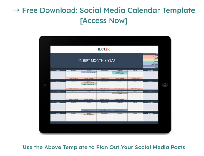
Image Source
Don’t forget about your PDFs and other non-HTML files.
This is a common mistake, which makes websites only partially compliant — even if all other WCAG criteria are met.
If you link to PDFs, PowerPoint presentations, Word documents, or other non-HTML-based files, make sure that assistive readers can see and use the text.
2. Ensure your design is user-friendly for all.
Emphasize contrast.
Color blindness or color vision deficiency is a serious issue, which affects 1 in 12 men and 1 in 200 women. But what does it actually mean when it comes to web design?
Let’s put it into perspective.
If you had a box of 24 colorful crayons for a person with moderate red/green color blindness and asked them to identify each color, they would only be able to recognize 5. So, if you only use color to communicate information, some users won’t be able to understand it.
On top of color, you should use patterns, fill, sizing, borders, icons, or whitespace. Also, make sure there is sufficient contrast between the background and the text. You can use the 4:5:1 contrast ratio for text, as suggested by WCAG 2.0 level AA compliance.
To find out the ratio for your text, you can test your colors on a contrast checker. These systems will both show your ratio and tell you if you pass current accessibility standards.
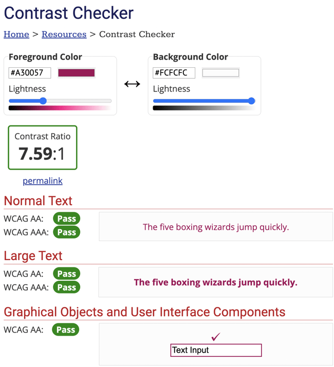
Image Source
Here are a few additional ideas for boosting contrast:
- Darken the darkest color.
- Lighten the lightest color
- Make the font bolder and increase your letter spacing.
- Make the font larger, just avoid too-tight letter spacing.
- Select a font with a different design.
Below are two versions of Hubspot’s home page. Notice how the colors change when you select the “high contrast” option at the top of the site:

Image Source
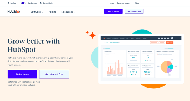
Image Source
Include alt text for images.
High chances are you use images on your website. Those that aren’t there for decorative purposes only must have alt text that describes neutrally what’s on the image. This also applies to images, which act as buttons or links.
You can add alt text directly in the HTML code of your image. Many content management systems also offer front-end options for adding alt text.

Optimize videos for accessibility.
According to Wyzowl, 88% of people were persuaded to buy a product or service by watching a video.
While video is a very powerful marketing tool, it has to be made accessible to different audiences to make the most of it. This includes creating subtitles for hearing-impaired individuals and having a transcript for visually-impaired users.
You can even go one step further and include a descriptive audio transcript, which could act as a high-quality alternative to the video.
3. Remember your website’s functional requirements.
Make it easy to navigate without a mouse.
Not everyone can use a mouse, especially those with visual or motor disabilities. However, they should still be able to easily navigate through your website with keyword navigation.
Make sure that users can use arrow keys and enter to move between sites and to click on various interface elements. This also applies to forms. Users should be able to fill them mouse-free.
Make sure your HTML has aria labels for links.
Aria-labels are an HTML attribute, which helps screen readers identify ambiguous elements. A great example is the “X” sign, used for closing a pop-up or full-screen mode.
For most website visitors, it will be clear what the element does. But, those who use a screen reader, might simply hear the letter “x” instead of “quit” or “exit dialog.” Here’s where an aria label comes in, telling the user what the button’s action is.

Image Source
Add labels to all fields and forms.
To make it easy for all users to fill out forms on your site, assign an HTML <label> tag to each field.
When a visitor starts entering their information through an assistive reader, they will understand the requirements for each field. This includes any validation rules, like using a special sign in the password.
Also, if they make any mistakes, like providing a phone number that is too short, they will be quickly informed.
Follow WCAG guidelines for ADA website compliance.
Making sure that your website is ADA-compliant brings two benefits. Firstly, it lets you ensure that all user groups feel welcome and have a great experience with your site. This positively contributes to your company image.
Secondly, it helps you avoid the risk of fines and lawsuits, and any website visitors feeling discriminated against. Follow the steps above to help all users make the most of their interaction with your website.
Thanks to our partner HubSpot for this article. What is an ADA-Compliant Website? The Complete Guide (hubspot.com)
Posted:
Tuesday 11 April 2023
Filed under:
accessibility,
cms,
content,
tips,
website