Responsive & Mobile Websites – 47% of website traffic in 2014 will be mobile.
OK, What's it all about?
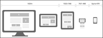
In simple terms responsive design means that your website re-sizes itself and its content based on the device. If it notices that the device is an Apple® iPhone or iPad then it renders the content accordingly. These layouts are pre-defined in the Content Management System and utilise the same content as the main browser based site. Alternately, you could create a separate site for each mobile site and platform; however, this is hardly desirable as you may have multiple areas of content that need updating each time you need to make a change to your website.
There are many options for us to consider when a client asks for a responsive website design and the suitability of these options depend on the individual business requirements and budget. It’s also important to consider any existing solutions or sites they already have. Creating a responsive website isn’t a complete mobile strategy and won’t answer every brief, but if you have a Content Management System like Kentico it is definitely achievable, because the functionality is already available.
PROS and CONS of Responsive Design
Below are the basic pros/cons of a responsive design over a separate site.
Pros
-
Single Version
-
Less Maintenance
-
Sharing links works across all platforms and devices
-
Future ready
-
Not just about devices - narrow desktop use available also
-
Mobile First – Content Strategy
|
Cons
-
Technical – Development time and resources
-
Cross Browser device and capabilities (lots of devices to think about)
-
Loading Times
-
508 Compliance (Image Sizes)
-
Existing content may not be mobile friendly and require some re-work
|
Will it work on what we have?
Not all sites will be responsive ready, but if you’re using a Content Management System already then the chances are good. Kentico is mobile ready. This means the mechanisms are in place to allow different layouts to be displayed based on the specific browser/device. On any other site, it is typical that only web browser layout and programming is setup, unless your website was built to be mobile friendly in the first place.
Kentico allows easy delivery of content for any format from mobile phones to tablet PCs, printer-friendly layouts to RSS XML feeds for a consistent, multi-channel experience.
-
Automatically detect the visitor’s device type
-
Serve content optimized for the visitor’s device
-
Ensure content is device independent
Engage your audience anywhere and get more for your marketing dollar with a site that is optimized for the iPhone/iPad, Blackberry, Google Android and other mobile devices.
-
Optimize your site for mobile viewing
-
Reach your customers wherever they are
-
Use your own mobile device to review changes

Mobile Design Methods
There are three popular methods for creating responsive designs.
Creating Separate Sites
One method is creating a separate site for browsers and another for mobiles. Typically you would use this method if you do not have a Content Management System or your Content Management System does not support responsive design.
You would build a totally separate site with a totally separate URL (like http://mobile.webdesignmagic.com.au.com.au or http://webdesignmagic.com.au/mobile ). This is problematic as you will have more than one base for content and will need edit multiple sites on every update; probably not a very efficient solution.
Creating separate Layouts
Layouts are how we display content. They are objects that we design and apply to the content just before it is shown on a device. This is how mobile design came about.
Each device will need a separate layout. Some examples are:
-
Normal Web Browser
-
iPhone/Smartphone (including orientation)
-
iPad/Tablet PC (possibly using the standard browser layout)
-
Printer
-
WAP (declining rapidly in popularity due to the smartphone market boom)

The Content Management System then responds to the device and selects the appropriate layout using placeholders. This methodology is standard at present and multiple layouts can be attached to one page or piece of content – again, this is not as efficient as it could be.
CSS3 and HTML
The newest method of creating responsive mobile design is by using CSS3 and HTML. It does not use layouts, so you only have one. Instead there are multiple versions of a CSS3 Style Sheet, which are selected using media queries. These media queries are defined based on device and the content is rendered accordingly, so you only need one page to hold all the content. Nice!

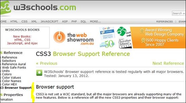
However, not all browsers support CSS3 or HTML 5, so the chances of your website not looking quite right on older browsers is possible, but there are techniques available to counter react this problem, so you can still use the latest and best method. Most new browsers do support this CSS version and it will become the standard in the near future. You can see a list of current browser support and versions here.
http://www.w3schools.com/cssref/css3_browsersupport.asp
So, where do we go from here?
Typically, the next question is ‘where do we go from here and what is the cost’? The problem is that we don’t know how far the client wishes to take their project or how much they are willing to spend to future proof the website.
We’re the Gurus, so you don’t have to be
You know your business best. We know systems and websites best. We use our experience, expertise and insights to match your business objectives to the technologies and website elements that will work. And then we help you to implement them.
Don’t know where to start?
Start by calling us now on 1300 308 210 or email us on [email protected] and we’ll get back to you within 24 hours. We’ll even provide a FREE consultation to help get you started.
Posted: Tuesday 28 January 2014