Building pages in Kentico Xperience: Page Builder and widgets vs. content tree pages and components
Two ways of building landing pages
In the current version of Kentico Xperience, the MVC and .NET Core development model provides Page Builder functionality incorporating page sections, widget zones and widgets. The Page Builder allows content editors to control the page layout and functionality by allowing them to visually arrange page components as they see fit.
But there is another, powerful and very functional way to build landing pages without the need for dropping widgets all over a template… Just quietly, I’ve even heard a few front-end types talking around the coffee machine singing its praises as this allows their front-end components to be isolated and allowing the page template to no longer be at the mercy of content editors.
How is this sorcery possible you ask? This method involves breaking up content tree nodes into two categories: landing-page page types and component page types—Lego building blocks is an analogy I like to use when explaining this methodology.
Let’s compare these two different ways of building landing pages.
Page Builder and widgets
Having done a fair few Kentico Xperience presentations, I’ll be the first to admit that this is the feature functionality that’s a real winner with content producers and decision makers in the room. Without a doubt, the Page Builder gives editors a lot of freedom when it comes to having control over the layout and presentation when building pages—not to mention, the UI makes it look very fancy. How does it all work? Let’s look at the basics.
Sections
Sections allow editors to add sub-layouts to a page which create sectioned widget zones. For example, adding a three-column section will add a sub-layout with three widget zones, laid out horizontally (see figures 1 and 2, below).
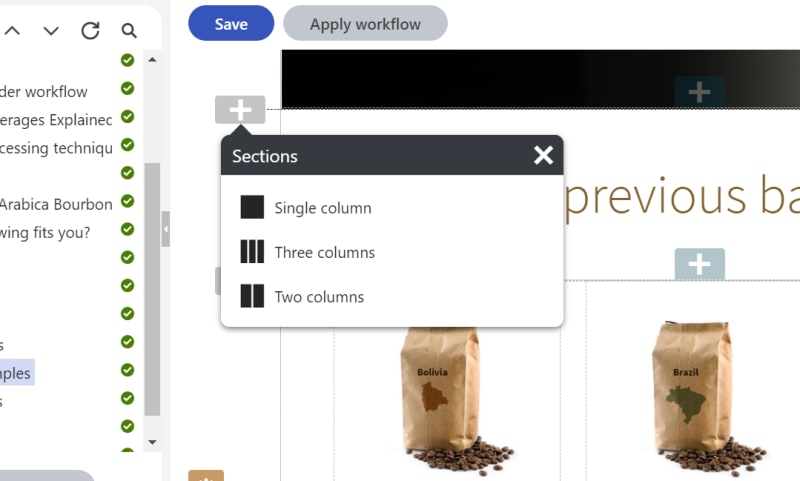
Figure 1: Adding a three column section
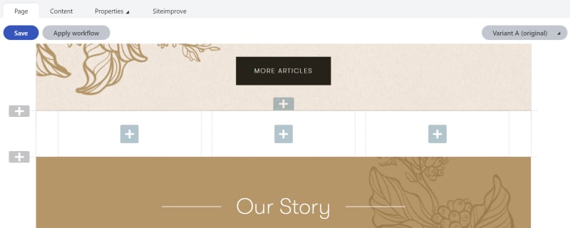
Figure 2: Three column section—three widget zones
Widgets
Widget zones allow editors to place widgets and to define content variants when dealing with content personalization. Editors can add a sub-set of out-of-the-box widgets and can also take advantage of custom-developed widgets from their development team (see figure 3). To ensure page integrity, allowed widgets can be specified for each widget zone—because no one likes a news article teaser where the banner should be.
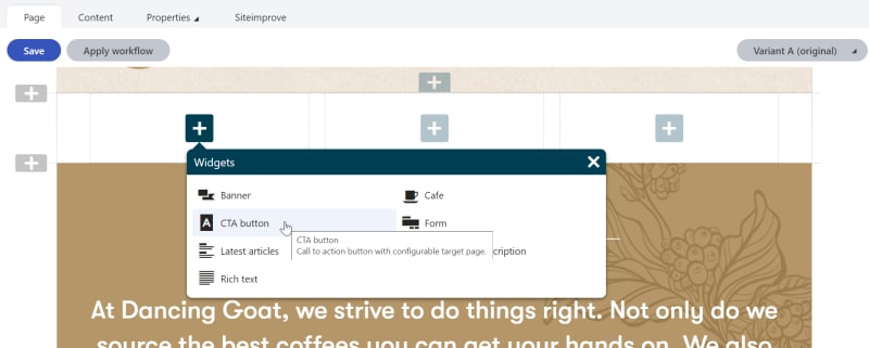
Figure 3: Adding widget to widget zone
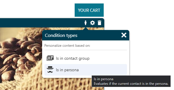
Figure 4: Setting a widget variant based on personas
And of course, as you’d expect, once you have configured the perfect page layout with sections and widgets placed exactly in the right places, you can save it as a reusable template and apply it to any new pages you create.
The Page Builder and widget method is fantastic for rapid page creation with visual control over the layout and the UI makes it easy for marketers to implement content personalization strategies easily. The advances on the MVC and .NET Core Page Builder have come leaps and bounds since the first MVC implementation some years ago. In a way, we’re seeing a return to the much-loved page building power of the former Portal Engine, without the bulk of the web forms architecture.
However, as Peter Parker’s uncle said: “with great power comes great responsibility” and this rings true in the case of the Page Builder. Care should be taken not to break the page layout by moving or deleting widgets, or by adding ill-fitting widgets where they don’t belong.
There are of course fail safes, such as locking widget zones down to only specific widgets, user/role strategies that only allow the right people to update pages, and of course versioning as a way to roll back.
Another consideration, as some front-end developers might agree, is that the more control that a content editor has over the layout of a web page, the more difficult it is to develop a front-end architecture to handle the unforeseen combinations of layout variations that will be created.
And lastly, enforcing a well-managed information architecture can be somewhat hindered by placing valuable content in widgets. Ideally, a content modelling strategy would be implemented to maintain an information architecture and that would be best enforced by way of content tree nodes.
So, what’s the alternative then?
Content tree pages and components
On the other side of the coin, we can shift the balance of power and tip it in favor of the presentation layer by taking some things away from the content editor and marketer alike. I can hear the “booooos” in the crowd but hear me out. There are specific cases when Page Builder flexibility is not as important as the stringent management of the information architecture and the integrity of the presentation layer. Not all pages on a website require flexible page building capabilities and content personalization—for example:
Define two kinds of page types
Landing pages
Landing pages are, as you’d expect, site pages with an associated URL such as a home page, about us page, news page, etc. As with all page types in Kentico Xperience, these will generally have some fields associated with them for attributes such as a page title, a rich-text field for content body, a banner image, and the list goes on.
However, based on this proposed approach, the idea is to keep the page type fields to a bare minimum and to have the landing page define as little of the data on the presentation layer as possible; this instead should be left to the component page types. The exception can be custom attributes that are not data/presentation related such as navigation and/or SEO settings. Thus, establishing the landing page as a blank canvas and the components as (Lego-like) building blocks.
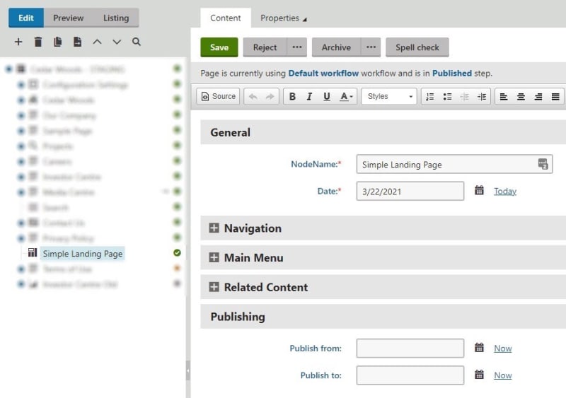
Figure 5: Landing page fields
Components
Components are broken down into two types: an item component and a container component. They are page types that are concerned with data that will be displayed on the landing page, they are the content building blocks which define what the landing page looks like.
Item components can be a page banner, a content block, an online form, the list goes on.
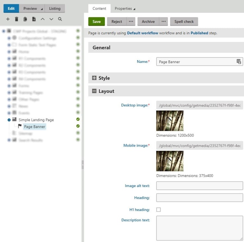
Figure 6: Component item fields
Container components are similar, but they are used to organize item components in a specific way and in the hierarchy, they live between a landing page and a component. An example of a container component is a news article teaser panel.
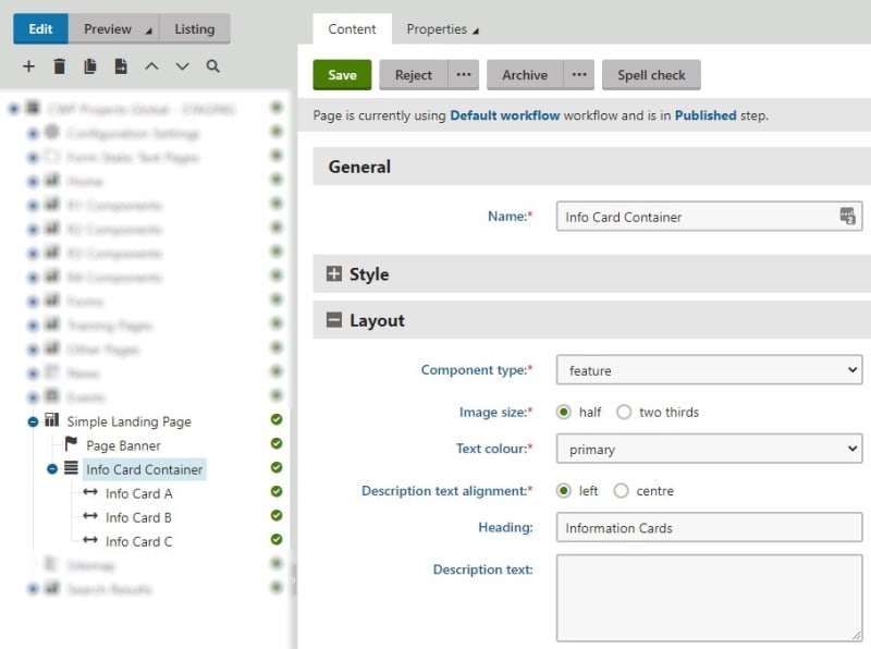
Figure 7: Component container fields
The main idea is that with the landing page acting as a blank canvas, a content editor adds component page types as child items of a landing page. At runtime, the business logic associated with the landing page retrieves all the component child items and renders them accordingly, in the order that they exist in the content tree. In essence, component page types act as an alternative to the widget (or previously, the web part).
This method still provides page building flexibility, albeit lacking in some features, but ensures that visual control is still the domain of the front-end architecture. Below (figure 8), we can see the resulting rendered page content based on the Simple Landing Page (figure 7) and its child components.
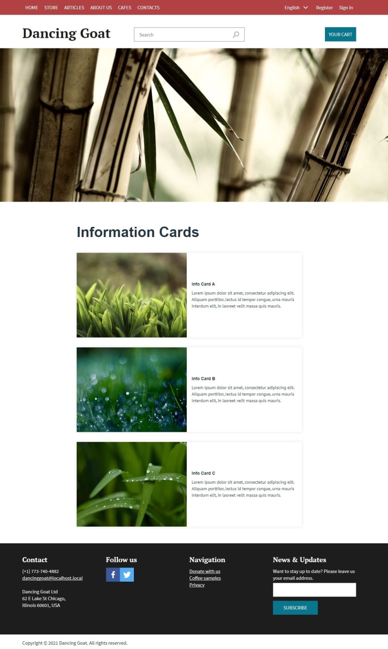
Figure 8: Rendered page based on landing page/component structure
This content tree-based approach is ideal when it comes to ensuring presentation layer integrity but weighing more heavily in favor of front-end framework control, albeit by sacrificing some of the editor experience. Likewise, for ensuring solid information architecture, keeping things in the content tree is the best approach. And lastly, if you’re ever inclined to using Kentico Xperience as a headless CMS and using API for content delivery, this is the obvious approach.
Coincidentally, if you’re interested in such sorcery, here is another shameless plug to another of my articles:
A New Approach to the CMS-Driven Website Development Model
There are of course limitations to this approach, the main one being the inability to build pages visually. Editors won’t have access to the great Page Builder features, which are one of the main selling points of Kentico Xperience; instead, they’ll need to rely on structured content and content creation the old-fashioned way with forms—with the occasional save and preview to ensure things are looking good.
Another limitation is content personalization as without widget zones, there is no easy way to create a content variant based on some segment. When I say there is no easy way, it’s not “impossible” and I (and my fellow dev team members) have indeed developed a way to get around this, where variants can be defined within the content tree, though it’s not as elegant as in the Page Builder—but that is a topic for another article. So yes, there are compromises but there are also advantages—it all comes down to the purpose of the web page.
Summary
Kentico Xperience has come a long way from the glory days of the web forms-based Portal Engine, to the, well, glory days of the MVC and .NET Core development models—which bring the amazing Page Builder functionality to many happy editors and marketers.
To easily manage landing pages, layouts, widgets and easily define segmentation-based content personalization, the Page Builder has all the right bells and whistles.
But if you’re concerned with tighter control of your presentation layer or if your information architecture is the most important aspect of your website, you’re going to want to consider sticking to the content-tree-based approach and adopting a landing page and component architecture.
By
Jake Kula
Posted: Friday 28 May 2021